Website Redesign
My role:
UX/UI Design
Year / Duration:
2019 / 1 month
Benni want to transform the way businesses provide workplace benefits. They believe that there’s a better way for businesses to offer more benefits to more of their people and for employees to be helped to learn about and choose their benefits. The challenge is to update the website making it upbeat and eye-catching.
The first request from TFG "This needs to be on brand with all three brands. It also needs to be high fasion and customer led".
This need to keep to the brand guidelines the use of brand colour, fonts and imegery.
The other constraints the amount of copy (text) on the page. it needs to be easy to navigate but also quick to the point.
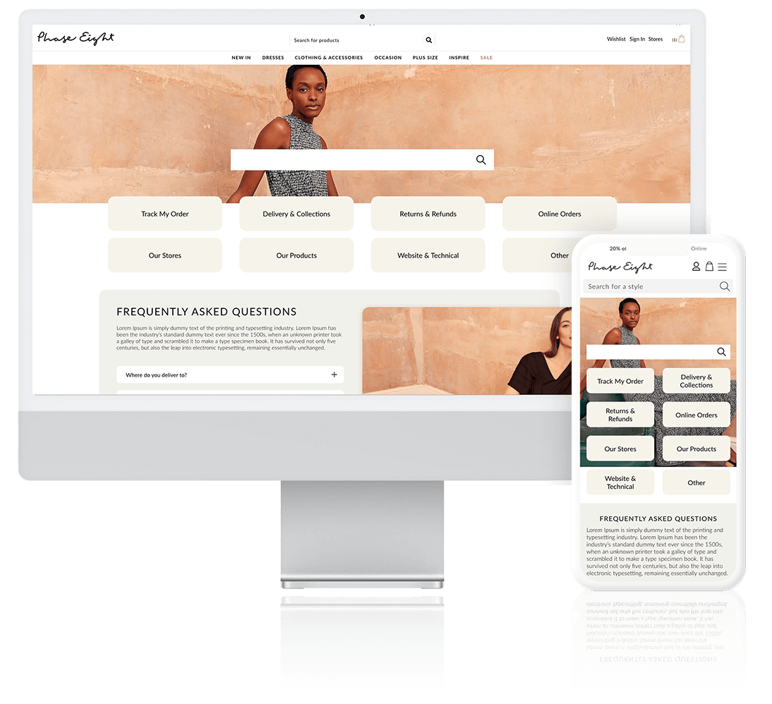
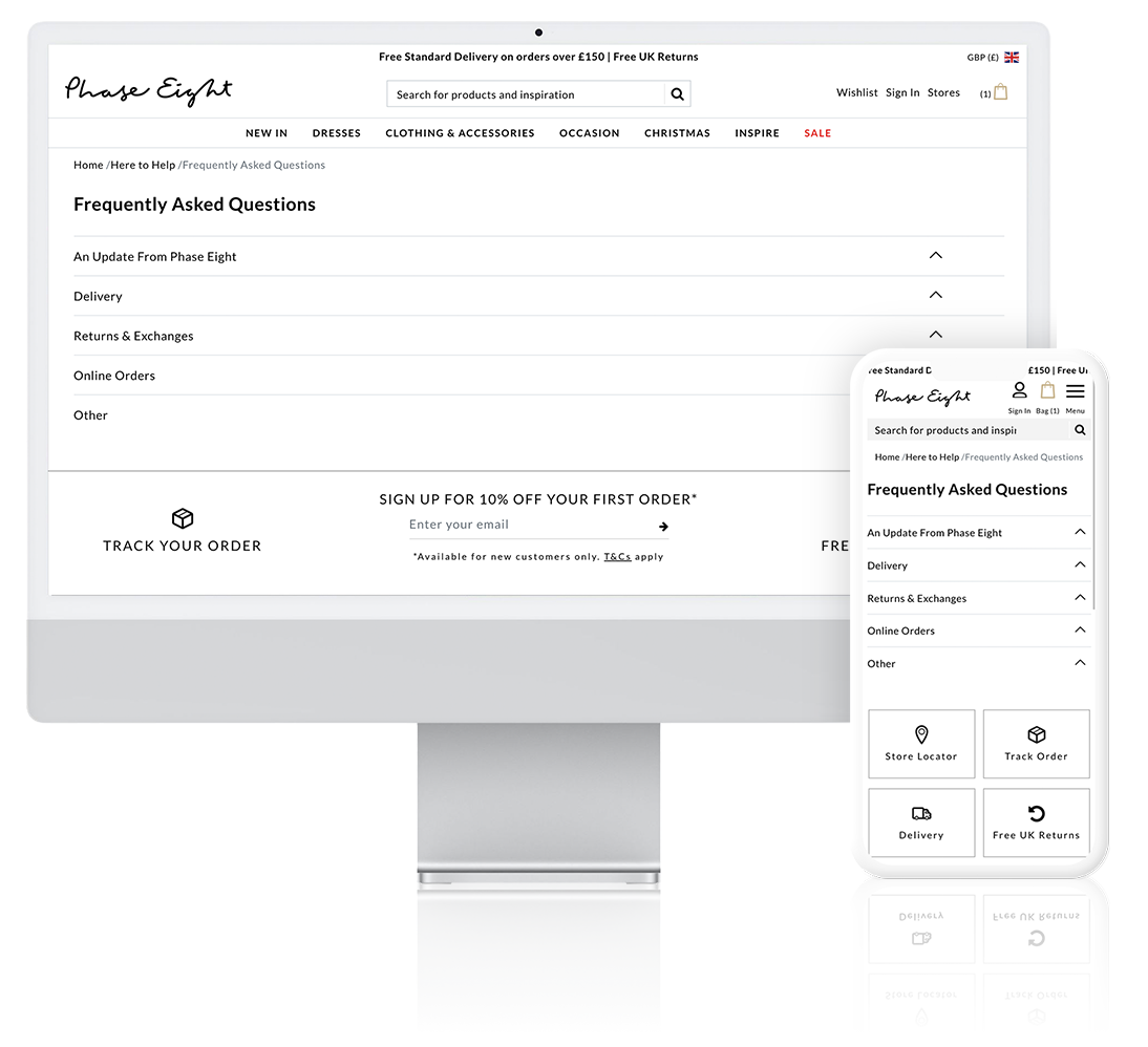
There were also some other considerations. When it comes to FAQ pages on ecommerce websites it needs to be easy for the customer to find what they are looking for.
Making it clear to the customer is very important. Having the top FAQ questions visible on the page straight away would be useful.
Finding out what are the most clicked on links on the current page and then seeing how they can be added to the page.
I looked at Benni's competitors ( Vitality, Personal Group and Virgin Active). These website are a great starting point to see how I can add different elements to the FAQ page. I also give me a way of understanding what the customer like to see on the page.
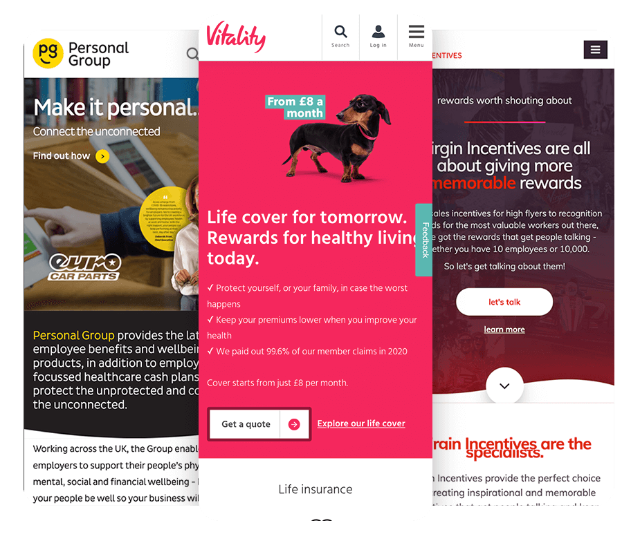
The desktop of Personal group is very creative. Customers are introduced to a sub brand “hapi” which is a play on words and meaning. Hapi is very similar to the word happy and Hapi was a provider god of Egypt. Personal Group seems to suggest that we will give you what you need to be happy. With the strong yellow colour, the curve to represent a smile and the play on words “hapi”, Personal Group clearly what to make the customer feel happy as soon as they enter the site.
The logo also has a quarter circle, which seems to portray a side grin. With the inclusion of the call to action buttons, Personal Group is setting up the customer to be happy with everything that they provide before they scroll down the page
The page is very spacious with no visible cut off until you scroll down to the bottom of the page. The layout follows the natural structure of how people read, left to right. Each group of text is split, left then right then left again.
The mobile has the same curve, which represents a smile, but this is after the fold of the page. The calls to action buttons are also before the fold so the customer can view the products straight away.
With key objectives to increase conversion rates and improve SEO, Working closely with Customer service manager and occasionally the Design director; leading the UX design and adopting a mobile first agile sprint approach to the UX and UI to breathe new life into their digital customer experience.

Siobhan is in her early 50s. She is always busy juggling life and work. She is used to facebook and enjoys shopping the latest trends.
Siobhan isn’t a frequent shopping on Phase Eight, Hobbs or Whistles, but she likes what she see on the websites.
She has recently brought an item from TFG but and is wondering why she hasnt recieve her item yet.
The current user flow is broken. The customer land on the home page or the benefits page, then they can click on the product call to action, which leads you to a downloadable pdf. Once the customer views the pdf they are off the site and they have no way of filling out the “make an enquiry” form.
On the home page and benefits page there is a “make and enquiry” form but as we previously saw from the scroll map and the click map, no one is clicking on the form.
With this suggested user flow the customers can clearly see the “make an enquiry” form. The will be places higher on the each page so that it is more noticeable.
Each product also has its own page; this helps with SEO of the site. Each page can have its own key words to drive traffic to the site. This also stops the customer journey from being broken and the customer can make an enquiry on every page.
Due to the customer not leaving the site they are able to view more than one product. The customers are able to shop without a broken path.
I created this Desktop prototype so that I can share my ideas with the stakeholders. Having working prototypes helps to bring ideas to life more then a flat wireframe. Interactions and animations show how the custoomer can interact with the webpage.
View Wireframe
I provide designs and solutions that go beyond skin-deep. User Experience is the science behind my designs, allowing a genuine focus on the product’s ease of use and the entire customer lifecycle.
My UX Strategy